Support widget: one script line, an Appearance builder for the look
The widget is a button in the corner of your site that opens the request form in a panel. It is the same form as your portal page, so a request sent through the widget lands in the same inbox and goes through the same email confirmation.
The snippet
Section titled “The snippet”Paste this line before </body> on every page where you want the button:
<script src="https://fewbase.com/support/widget.js" data-tenant="<address>" async></script>data-tenant is your portal address from settings and is the only
required attribute. The Appearance tab in the header (owner only)
shows this exact line, ready to copy, at the bottom of the page.
Appearance
Section titled “Appearance”The Appearance tab controls the look of the button, the panel, the form, the portal page and the customer pages — one set of settings for all of them. Nothing is in the script tag: the widget fetches the current settings from the service, so a change here reaches every site with the snippet on its own.
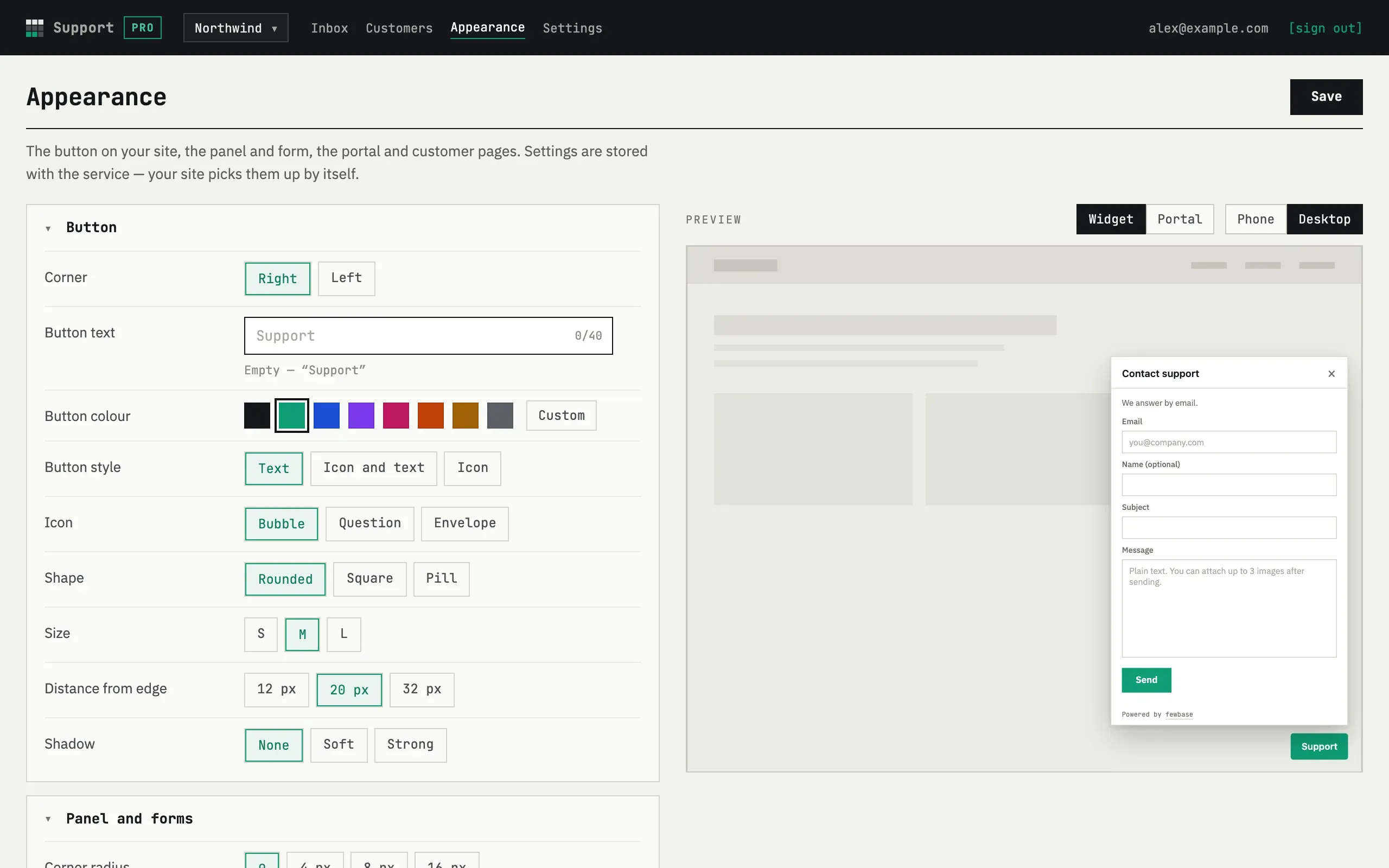
The settings are grouped on the left:
- Button — corner, button text, colour, style (text, icon and text, or icon only), icon, shape, size, distance from the edge, shadow.
- Panel and forms — corner radius, theme (light, dark or follow system), accent colour (submit button, focus, links), form title and subtitle, panel size, the “Powered by fewbase” line.
- Form fields — name (optional, required or hidden), subject (shown, or hidden and taken from the first line of the message, up to 80 characters), and the text shown after sending.
- Language — the widget form’s language, independent of your site’s own locale.
- Behaviour — hide the button on phones, open the panel from a link
with
#support, and your own trigger button (see below).
The panel on the right previews the result live: switch between Widget and Portal, and between Phone and Desktop. Changing a setting updates the preview at once; changing text, colour or theme reloads the form inside the preview after a short pause.
Press Save to apply the settings, or Reset to defaults to go back to the original look. Saved changes reach your sites within a couple of minutes — the widget checks the current settings on its own, there is nothing to repaste.
Settings marked PRO need a Pro or Business plan; on Free they show their default value and cannot be changed. See Plans and limits for the full list. Without JavaScript, the page still works as a plain form — the preview just updates after you press Save instead of live.
Old script attributes
Section titled “Old script attributes”Earlier versions of the widget read data-position, data-label,
data-color and data-lang from the script tag itself. If your site’s
snippet still has any of these, they override whatever you save in
Appearance — remove them from the tag on your site to use the settings
saved here instead. The tag needs no attributes beyond data-tenant
anymore.
Your own button
Section titled “Your own button”Instead of the floating button, you can open the panel from any element
already on your page. Set Your own button to a CSS selector, such as
#help or .js-support, and the floating button stops being drawn — a
click on any element matching that selector opens the panel instead. This
setting is available on Pro and Business.
Open from your code
Section titled “Open from your code”window.fewbaseSupport.open() and window.fewbaseSupport.close() open and
close the panel from your own JavaScript — a menu item, a keyboard
shortcut, anything. This is available on every plan and needs no setting.
Open by link
Section titled “Open by link”Turn on Open the panel from a link with #support and any link to your
page ending in #support opens the panel as soon as it loads — useful for
a “Contact support” link in an email or another page.
Mobile
Section titled “Mobile”Turn on Hide the button on phones to stop drawing the floating button
on narrow screens (under 640 px wide). The panel still opens through your
own button or fewbaseSupport.open() — hiding the floating button does not
disable the widget.
Why a frame
Section titled “Why a frame”The widget is a script without dependencies; the button and panel live in
a shadow root so your site’s styles and the widget’s do not leak into each
other. The panel itself is an <iframe> that loads the form from
fewbase.com/support/w/<address>. The spam check on the form (Cloudflare
Turnstile) verifies the hostname of the page it runs on — with the frame,
that hostname is always fewbase.com, so there is nothing to register or
configure for your own domain. The frame also records which page of your
site the customer opened the widget from; you see it in the thread as
page:.
If the snippet is pasted twice on one page, the second copy does nothing.
Site builders
Section titled “Site builders”Any builder that lets you add a custom HTML block or a “footer script” works — paste the snippet as is. The script sets no cookies on your site and needs no stylesheet; the form is loaded only when the button is first pressed. Esc or the × in the panel header closes it.
The button is in the wrong place or moves with a section
The widget attaches itself to <body>, wherever the snippet sits, and the
panel is positioned relative to the browser window. If your site applies a
transform, filter or perspective rule to body or html — some
builders do this to animate an off-canvas menu — browsers position the
panel relative to that element instead. Remove the rule from body/html
or move it to an inner wrapper; moving the snippet itself changes nothing.
Can the widget show the conversation?
No — the widget is only the form. Replies go by email, and the customer opens the thread on their personal page on fewbase.com. See What your customer sees.